Introduction
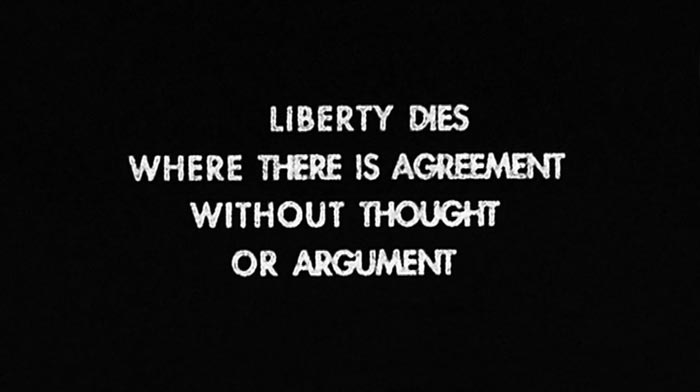
His words read like ad slogans gone off message.
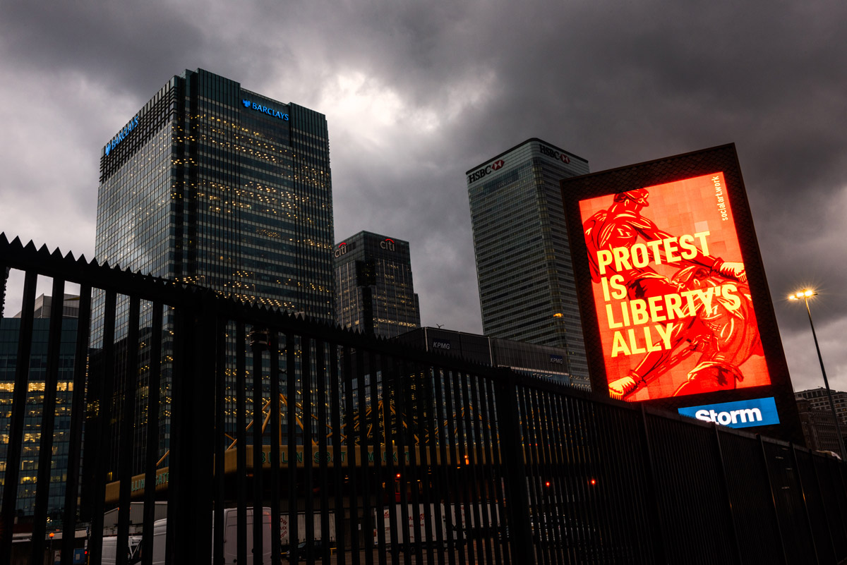
Protest is liberty’s ally. Ageing is a privilege not a predicament. Learn to love rain.
Protest Is Liberty's Ally,
2019
2019.4.9
In his book,
First You Write a Sentence
(Penguin 2019),
the British cultural historian, Joe Moran, notes Martin Firrell’s sly subversion of the advertising form to create public art: ‘His words read like ad slogans gone off message.
Protest is liberty’s ally. Ageing is a privilege not a predicament. Learn to love rain.
’
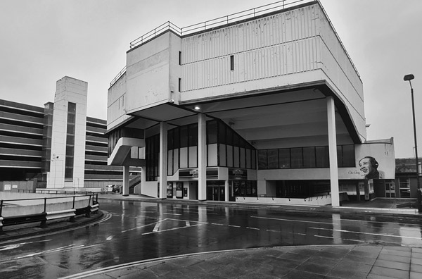
It’s a little-known fact that Firrell’s maternal grandfather was a signwriter and billsticker; that advertising, then, was bred in the bone. The artist’s fascination began with his first exposure to cinema advertising at the fiercely brutalist Odeon, Anglia Square.
Anglia Square was a wildly ambitious 1970s development - a modernist masterpiece or an unmitigated monstrosity, depending on your point of view. Built on a concrete raft and rising above the centre of the square, the new Odeon cinema had a vast 800 seat auditorium.
NOTE
Anglia Square was designed by Alan Cooke Associates and opened in 1970. It took six years to build and was never completed. Shop-lined pedestrian walkways lead onto the square itself which was open to the elements. The former HMSO building, Sovereign House, forms the western boundary of the centre. To some a brutalist masterpiece, to others a horrendous mistake, Sovereign House now stands empty and is due for demolition. Built on a concrete raft, rising above the centre of the square and giving it much of its architectural character is the Odeon cinema, also by Alan Cooke Associates and opened on 8 July 1971.
Odeon Cinema, Anglia Square Norwich
b1972.1
In the cinema advertising of the time, tonic water fizzed in widescreen and ultra slow motion over ice cubes large as icebergs (for Gordon’s Gin). The soundtrack was suggestive of an avalanche or a collapsing glacier. The physical scale of the Anglia Square cinema emphasised the scale of the advertising image, its compositional simplicity, the glacial force of the slow-motion cinematography.
Scale was, and is, an important consideration in the artist’s work; both the scale of the individual billboard structures and the scale of a ‘campaign’ of artworks distributed to every corner of the exhibiting territory.
1970s billboards for Lamb’s Navy Rum with Bond-girl-to-be Caroline Munro appeared in the streets surrounding Anglia Square.
NOTE
Caroline Jane Munro (b. 1949), English actress, model and singer known for horror, science fiction and action films of the 1970s and 80s.
Munro in an unzipped wet-suit was classic 'cheesecake' but her presence in an otherwise mundane neighbourhood near the artist’s childhood home was also a profound challenge to provincial conservatism. These posters seemed so provocative and glamorous - a world away from the experiences of a provincial childhood. They were very simply executed, very sexualised and for a suburban backwater in Norfolk, radical. It was as if they set out, however subtly, to subvert suburban norms, to challenge all kinds of suppression by being openly sexual, hedonistic, cosmopolitan. They promised intoxication - both literal and metaphorical - freedom, escape, erotic fulfilment even. It felt like an illicit invitation to transgress and Firrell did so, confounding parental expectations and becoming a copywriter in a famous London advertising agency.
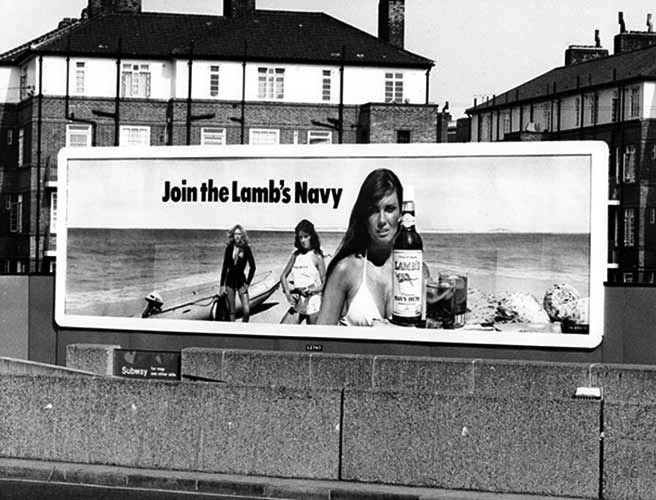
Caroline Munro, Lamb's Navy Rum billboard c.1980
bc.1980
The advertising industry was very different in the 1980s. Large agencies like Saatchi & Saatchi wielded enormous power and huge sums of money flowed into, and through, the industry. This was the era of Thatcherism, of the creed that greed is good, of Porsches and red braces, neo-liberalism, rampant sexism, and woeful homophobia in the form of the UK’s notorious anti LGBT+ legislation, Section 28.
Benson and Hedges cigarettes were advertised in cinemas with a surrealist-inspired assemblage of Iguanas, swimming pool, and frogman. Heineken was ‘refreshing the parts other beers cannot reach’. For Levi’s, Nick Kamen
NOTE
Ivor Neville 'Nick' Kamen (1962 – 2021) was a British singer, songwriter and model of mixed Burmese, Irish, Dutch and French descent. He was best known for the singles
Each Time You Break My Heart
from 1986 and
I Promised Myself
from 1990, as well as for appearing in the 1985 Levi's advert.
stripped down to his boxers accompanied by Marvin Gaye’s
I Heard It Through the Grapevine.
Television advertising could deftly and swiftly shape the ideas of the nation (the Y-front was effectively ended by Kamen and Levi’s; saved only by Calvin Klein’s brazenly homoerotic Marky Mark billboards a decade later).
The novelist Faye Weldon wrote ‘Go to Work on an Egg’ for the Egg Marketing Board; Firrell wrote ‘It’s good. But not that good’ for Tennent’s Pilsner from Bass Brewery. (Tennent’s was being marketed as a good, standard lager - with a price to match.) Even then, Firrell’s use of language was characteristically direct. The strength of the Tennent’s copy line comes from the explicit candour of the statement, especially when the majority of advertising in the same category dealt in extravagant hyperbole like Heineken’s ‘refreshing the parts...’
As Joe Moran has observed, Firrell is uniquely well equipped to hijack public space with stealthily subversive declarations like
Protest Is Liberty's Ally.
It’s clear that copywriting taught Firrell, above all, that words matter. Words make money. Words change things.
2008.1
Moran reminds us that text art belongs to a long literary and artistic tradition. Some of the earliest writing in history took the form of the epigram engraved on the bases of tombs. Samples survive from the 8th Century BCE. The traveller in antiquity would see these short texts by the roadside just as advertising hoardings are seen today. The ancients perfected the epigram, expressing the most with the least.
According to the artist, ‘Text unfolds necessarily in time, and I was envious of the painters where everything in a painting is available in a single field. I wanted to make words work like a picture so I turned to the epigram. When I wrote, ‘All Men Are Dangerous’
(Tate Britain, 2006),
I wrote something of immense truthfulness and importance with all of its meaning available in a single field.’
Fittingly, the billboard has long had a dual heritage as an advertising vehicle and a political instrument. As former British Council Chair, Stevie Spring
CBE,
reminds us in her introduction to this catalogue raisonné, billboards are the ‘only truly mass broadcast medium left. You don't have to seek them out. They find you’. The French protests of May 1968 produced many graphically innovative posters that were revolutionary both politically and aesthetically. Given the dual nature of Firrell’s project - to create art and to engage the imagination of protest - it comes as no surprise that he should be attracted to the billboard as a medium.
In
The Art of Protest
(Gestalten, Berlin 2021)
Firrell’s billboard artworks are described as ‘socially engaged texts that co-opt traditional advertising language and imagery’. Firrell’s works do not subvert the billboard medium; they are not covert or guerilla interventions designed to disrupt the flow of information. They are intimately associated with the quotidian stream of commercial messaging. They work just like advertising. Often they look very similar to advertising except, on closer inspection, something is amiss because nothing is for sale.
These artworks operate not as a spectacle, but as soft power, arising here, there and everywhere, reaching people and communities who might not otherwise be very well served by the art world. Their unheralded and gentle ubiquity is an important aspect of their value. The British LGBT+ pioneer, Quentin Crisp,
NOTE
Quentin Crisp (born Denis Charles Pratt, 1908-1999) was an English writer, performer, raconteur and wit. Firrell had lunch with Crisp in New York at The Cooper Square Restaurant on the corner of E5th street and 2nd Avenue on 2 November 1997.
once said, ‘I have nothing to offer the world but my availability’ and this is also true of the billboard artworks in this catalogue raisonné. The art is unmediated. It is simply available. There is a generosity in working in this way because it requires the artist (and the artist’s commissioners) to have faith that a public will look and engage even though the artworks arrive entirely unannounced and unframed; it may never be possible to quantify their impact with any certainty.
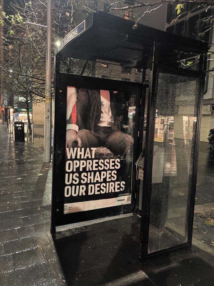
What Oppresses Us Shapes Our Desires,
2022
2022.4b
Firrell’s artworks can be regarded, then, as strange fruit, scions of advertising, altered and re-engineered forms of advertising, where the original model is still visible just under the surface. Whereas advertising aims to sell you material goods or services, Firrell’s ‘strange-offspring of advertising’ ask you to buy a point of view, a position. The goal is not to open your wallet but to open your mind to the possibility that the world might be reshaped - with your help - into a kinder place. Like so much advertising, these artworks are peddling an image but in this case that image is the artist’s vision of a world made more humane - made wholly beautiful - by justice for all.
Firrell's billboard artworks have appeared on commercial billboards in the UK, the US, Denmark, Finland, France, Ireland, Latvia, Netherlands, Norway, Poland, Spain, Sweden and Switzerland between 1998 and the present.
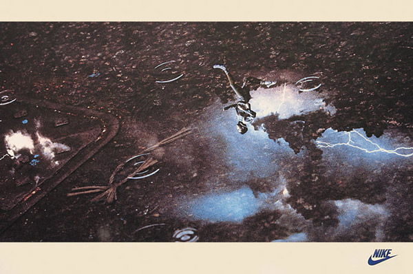
Two advertisements in particular, created by Firrell (with art director Mark Currie at Grey Advertising) in the 1980s, point to his future development as an artist. The first is an uncharacteristically wordless ad for Nike running shoes.
NOTE
Advertisement for Nike running, art director Mark Currie; copywriter Martin Firrell; photographer Graham Hughes; 1984.
Runner,
with Mark Currie, 1987
b1987.2
It is notable for its ruthless simplicity - the figure of a runner is reflected in a puddle of rainwater on a stormy night. Running at night in the cold and rain signals that this is a serious runner and by inference serious runners choose Nike.
The second advertisement is a 48-sheet billboard in which the text serves to confirm a ‘sighting’ of Nike boots on the feet of first-rate football players at one of the greatest clubs in the world.
These early advertising examples illustrate the artist’s efforts to reduce and simplify his work and, at the same time, to present it on the greatest possible physical scale (a 48-sheet billboard is 20ft x 10ft / 6.1m x 3.05m).
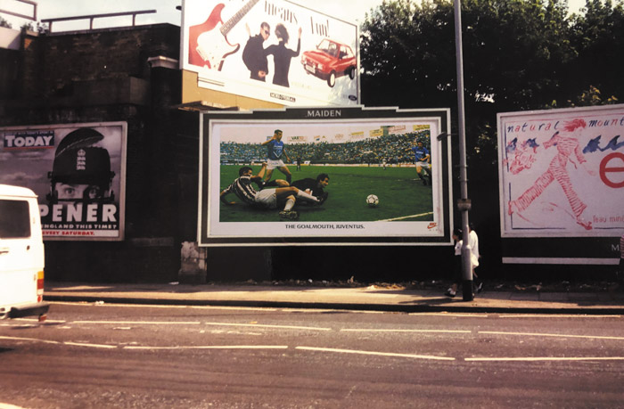
The Goalmouth Juventus
(with Mark Currie), 1987
b1987.1b
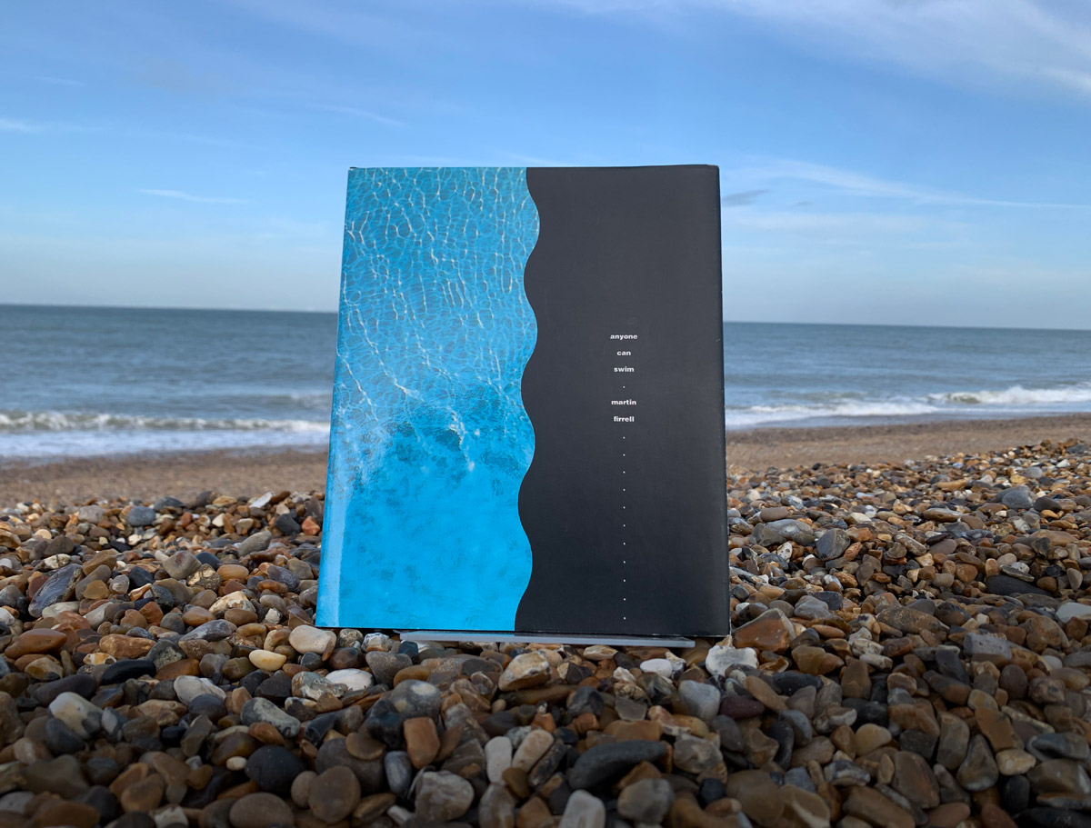
Contemporaneously, Firrell was creating and publishing experimental texts in small, limited editions.
Anyone Can Swim
NOTE
Martin Firrell (Author) / Sarah Cannon (Editor) Madeleine Bennett (Designer); Providence Press, 9 December 1992
ISBN 978-1874390015.
b1992
is a poetic evocation of growing up. It recalls a childhood spent happily by the sea but the text also calls for the world to be made fairer. Prefiguring the protest works to come, the text demands ‘for all humankind, even-handedness and justice…’
The monograph
Martin Firrell
(Zurich Books, 2020),
contends that it is the imagination of protest - the text and imagery of protest - rather than the act of protest itself, which stands at the core of the artist’s interest. Firrell attempts to illuminate routes to justice and this is why his work is important. Rather than protesting against social inequality, he explores the moral content of socialism and the cultural and political history of trade unionism, for example. Rather than comment on the divisiveness of contemporary politics, he looks to history and the imagination of 1960s hippy activism for answers.
These attempts at problem solving are intimately bound to the aim of creating something ‘beautiful’ in the very precise sense that Firrell uses that word. In an interview for the documentary
Overthrow the Social Order,
NOTE
Directed by Oliver Guy-Watkins, Hyde Hill Productions, Visions Du Reel Media Library 2018 / Sky Arts New Zealand, 2018.
he was asked why his works weren’t more concerned with aesthetics. The answer he gave is worth reproducing here in full:
I suppose everything hinges on your definition of beauty. What could be more beautiful than trying to say something about the world being fairer, more just. I can’t think of anything more exquisitely wondrous - the immense and vast beauty of justice. I think that’s the ultimate. It’s better than all the coloured paint in the world; for me anyway.
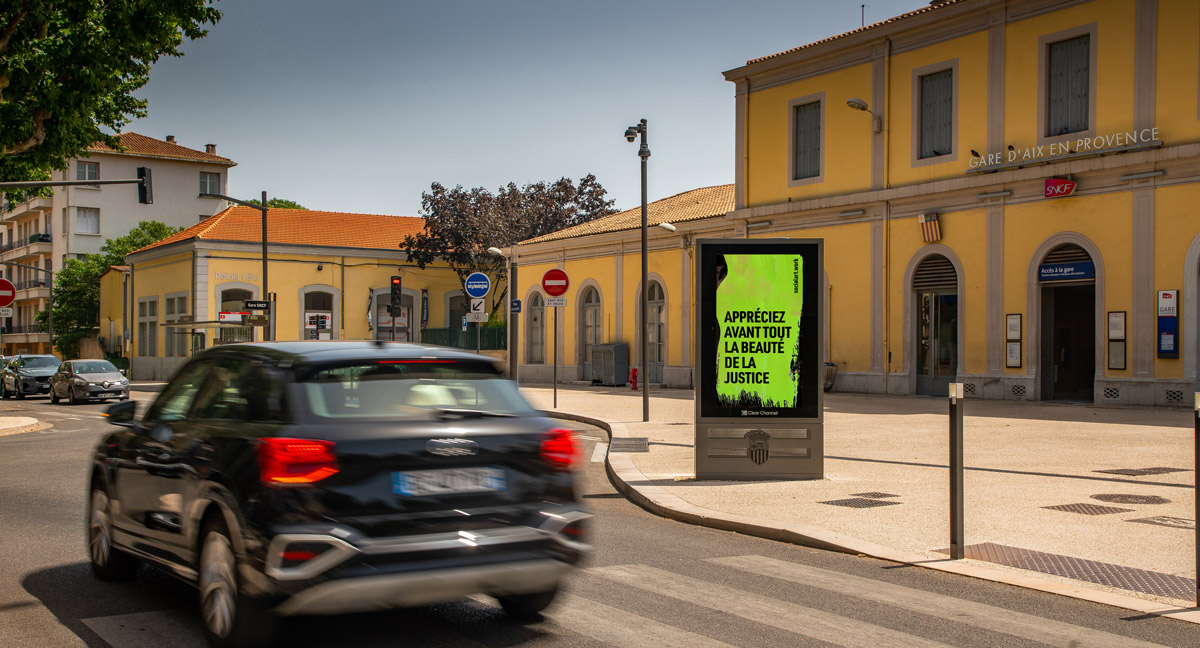
Prize the Beauty of Justice Above All Else,
Aix en Provence France, 2023
2023.2.3
These words prefigure the first of 2023’s
4 Tenets for Europe
(2023.2.1 - 2023.2.18).
Across 11 European countries, in 9 languages, the artwork encourages those publics to ‘prize the beauty of justice above all else’.
In the early part of the 20th Century, the philosopher and esotericist Rudolf Steiner wrote,
NOTE
Rudolf Joseph Lorenz Steiner (1861-1925) founder of the Anthroposophical Society, cultural theorist, architect of the Goetheanum at Dornach, Basel Switzerland.
‘A thing of beauty comes to appearance or shines forth, that is, it shows its inner nature on the surface. This is the character of beauty, that it does not hide away but presents its inner nature in outer form.’
Steiner looked to what he called ‘the genius of language’ for insight into human experience. It is impossible to ignore the role language plays in cognition. We simply cannot think beyond the limits of language and, equally, language shapes the content of what we are able to think.
In German, the word ‘beautiful’ (das Schoene) is related to the word ‘shining’ (das Scheinende). According to Steiner, it is the distinguishing quality of the beautiful ‘not to hide itself, but to carry its essence into outer configuration’. Steiner describes beauty as ‘raying forth’.
The openness and directness of Martin Firrell’s work, its ubiquitous availability as a sort of ‘advertising of the soul’, is the source of both its force and its beauty in the Steinerian sense.
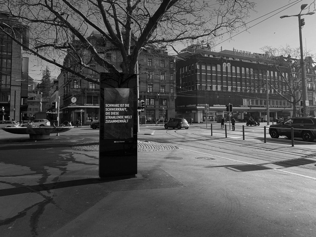
Black Is the Gravity that Tethers the Luminous World,
Zürich Switzerland, 2021
2021.1.3
Many artists before Firrell have presented work in that most public of mediums, the advertising billboard. The poster and the arts have a long shared history. According to London's Victoria and Albert Museum, one of the earliest known examples of the poster dates from 1477: a simple block of text promoting a handbook for priests. The French poster artist Jules Chéret (1836–1932) created the first colour lithograph poster as long ago as 1866 and, though often criticised at the time, Toulouse-Lautrec's work in the poster medium is now acknowledged as seminal from an art-historical point of view.
But uniquely, no other artist has shared Firrell’s level of commitment to the billboard medium, creating such a large body of work over many decades, all of it expressly for the form. It is a subtle but important distinction that Firrell's works have been conceived as billboards, and are inseparable from the medium. Contrast this with the majority of artists who have simply shown existing works on billboards with varying degrees of success.
It is also important to note that no other artist has explored serialism in the medium to a similar extent. For example, the
Counter Culture Rising series
(2020.1.1 - 2020.1.12)
consists of twelve digital billboards used to convey a single cinematic narrative. Collectively, the billboards tell a prescient story of alien visitation, warnings about climate catastrophe and war, the threat posed by machine intelligence, the profound power of living peacefully, and the possibility of advanced states of consciousness.
In no small part, this seriality has been made practically possible by the artist's longstanding relationships with commercial billboard companies. Firrell’s association with one of the world’s largest billboard companies, Clear Channel, now spans 4 decades and at least 3 CEOs: Stevie Spring under whose leadership the company first showed the artist’s work in 1998; Mathew Dearden who made possible the award-winning trans-inclusive project
All Identity Is Constructed
in 2016; and the current CEO, Justin Cochrane, who invited Firrell to be Artist in Residence at Clear Channel between 2018 and 2020, and who continues to be an important and informed supporter of the artist’s work in public space.
Firrell has hijacked advertising’s means to achieve artistic-activist ends. This co-opting of commercial technique and syntax, together with his sustained and wholesale colonisation of advertising’s oldest and boldest medium, makes him one of the most apposite and significant artists of the 21st Century.
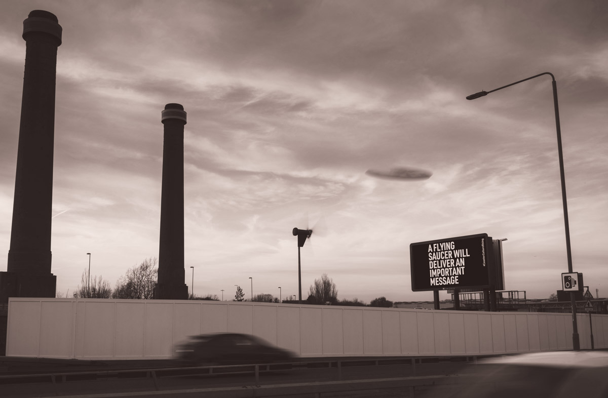
A Flying Saucer Will Deliver an Important Message,
2020 from
Counter Culture Rising
2020.1.1b